PATA

Leading forest management, timber production, logistics and trade company in Latvia. A reliable business partner across the whole forest management and logging cycle.
UX
UI
Pata system study case
2025


THE PROJECT ITSELF:
Project Overview
PATA is a B2B platform designed to manage end-to-end timber transactions between the company and its private and business clients.
It centralizes complex workflows into a single digital system, including document and contract management, process tracking, and logistics coordination.
Problem:
Timber transaction management at PATA was fragmented, manual, and inefficient. Data was dispersed across multiple systems and paper-based processes, leading to duplication, inconsistencies, and errors. Employees had to manually track transactions and handle documentation, while clients lacked visibility and struggled to follow the process.
Goal:
Design a centralized digital platform that simplifies complex workflows, reduces manual effort, and provides a clear, transparent experience for both employees and clients.
My role:
UX/UI Designer leading the end-to-end design of the system.
Responsibilities:
• mapping complex workflows
• defining system structure and information architecture
• designing end-to-end user flows
• creating wireframes and high-fidelity UI
• iterating based on stakeholder input and testing
• aligning design decisions with business needs
ALL ABOUT THIS USEARS
Usear Reasarch
To better understand the challenges within the existing workflow, we analyzed how both employees and clients interact with the system.
The research focused on identifying friction points across daily operations, communication, and transaction management.
Pain Points
1.
General navigation:
The system lacked a clear structure, making it difficult for users to understand where they are in the process or how to proceed.
Information was scattered across different areas, leading to confusion and inefficiency.
2.
Process visibility:
Users had limited visibility into transaction progress.
This created uncertainty, frequent follow-ups, and reliance on manual communication to track status updates.
3.
Communication gaps:
Communication between stakeholders was fragmented and often happened outside the system.
This led to delays, miscommunication, and lack of documentation for important interactions.
Users Personas
To better represent the system’s users, we defined key personas based on real usage patterns and operational needs.
These personas helped guide design decisions and ensure the solution addresses both business and user expectations.

User Journey map
To better understand the user experience across the system, a journey map was created to visualize the key steps users go through while managing a transaction.
This helped identify friction points, inefficiencies, and opportunities for improvement throughout the process.

THE PROJECT ITSELF:
Starting the design
I created various diagrams and storyboards to clarify and analyze the app's information and architecture. Afterward, I sketched paper wireframes and then transitioned to digital wireframes, building a low-fidelity prototype to conduct initial usability studies with stakeholders.
Storyboards
To better visualize the user experience, a storyboard was created to illustrate key moments in the user’s journey.
This helped translate system interactions into real-life scenarios, highlighting user behavior, emotions, and context.

System Map
It’s a structured scheme that outlines the pages and content hierarchy of the system.
Next step was creating the application map.
The goal was to define a clear and scalable information architecture that improves navigation and reduces user confusion.
The structure was designed to simplify complex workflows and provide users with a logical, easy-to-follow path across the system.

Wireframe
These early sketches focused on defining the core structure of the system and exploring different layout directions.
They helped visualize key components and understand how users would interact with the interface.
I created multiple wireframe variations to explore different approaches to structuring the system’s main screens.
Each version tested layout, hierarchy, and content distribution.
After reviewing all options, I combined the strongest elements into a refined direction that better supports usability and clarity.
The goal was to iterate quickly, validate ideas early, and reduce complexity before moving into high-fidelity design.

Usability Studies
This stage focuses on evaluating real user behavior and identifying usability issues early in the design process.
I conducted unmoderated usability testing sessions with a small group of users using the initial low-fidelity prototype. Participants completed key tasks while sharing their thoughts and difficulties.
After analyzing the results, I identified recurring patterns and key usability gaps. The goal was to uncover pain points early and improve the experience before moving to high-fidelity design.
1.
Onboarding clarity
Users lacked orientation when entering the system. There was no clear introduction or guidance.
2.
Navigation & discoverability
Users struggled to find key actions and understand the hierarchy between sections (Clients, Addresses, Transport).
3.
Action visibility & feedback
Important actions were not always clear, and users expected better feedback after completing tasks (confirmation, status updates).
The Clear Vesion
Refinig Design
Based on the usability findings, I translated the improved structure into high-fidelity mockups, ensuring consistency across all screens and components. The focus was on clarity, hierarchy, and a scalable design system.
Mockups
These are high-fidelity designs that represent the final product.
On this stage, I translated the insights from usability testing into a clear, high-fidelity design system.
I created structured mockups that reflect the final product, focusing on clarity, hierarchy, and consistency across all screens.
After that, I built an interactive high-fidelity prototype to simulate real user interactions and validate the full experience.The mockups include all core screens such as dashboards, tables, forms, and communication flows, using consistent typography, spacing, and visual components. The goal was to deliver a realistic and development-ready representation of the product.


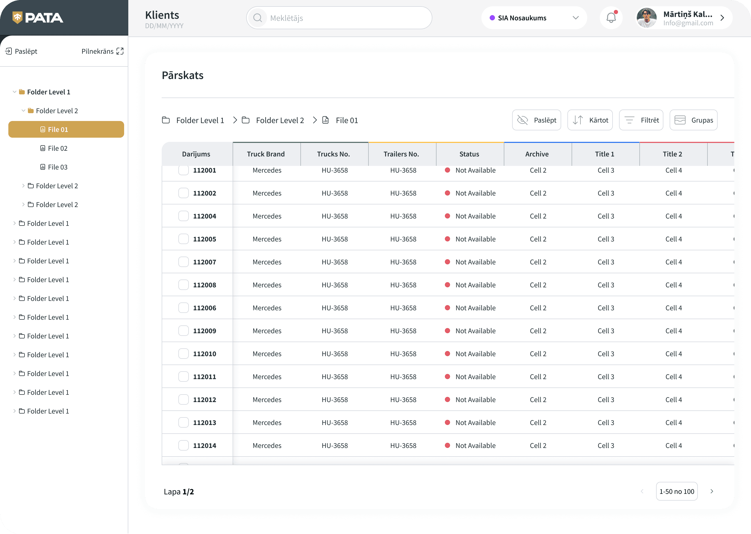

High fidelity Prototype
It’s the detailed, interactive version of the product that closely represents the final experience.
I transformed the mockups into an interactive prototype, enabling real user flows with gestures, transitions, and micro-interactions.
This allowed testing the product in a realistic environment and validating usability before development.
THE PROJECT SCHEMATICALLY:
Outcome
I explored the product through diagrams and storyboards to better understand its structure and user flows.
Then, I translated these insights into paper wireframes and later into digital wireframes, building a low-fidelity prototype for initial usability testing with stakeholders.
Takeways
Key insights gathered throughout the process, highlighting what worked, what didn’t, and how it shaped the final design decisions.
Impact:
The system became more intuitive and efficient to use, especially in handling complex data, navigation, and task completion across different modules.
What I learned:
Even small UX improvements can significantly impact complex systems. Clear structure and real user needs should always guide design decisions.
Next Steps
The next actions planned to further improve the product, based on insights, testing results, and identified opportunities.
1.
Conduct follow-up usability testing on the refined system
2.
Identify additional user needs and explore new feature opportunities